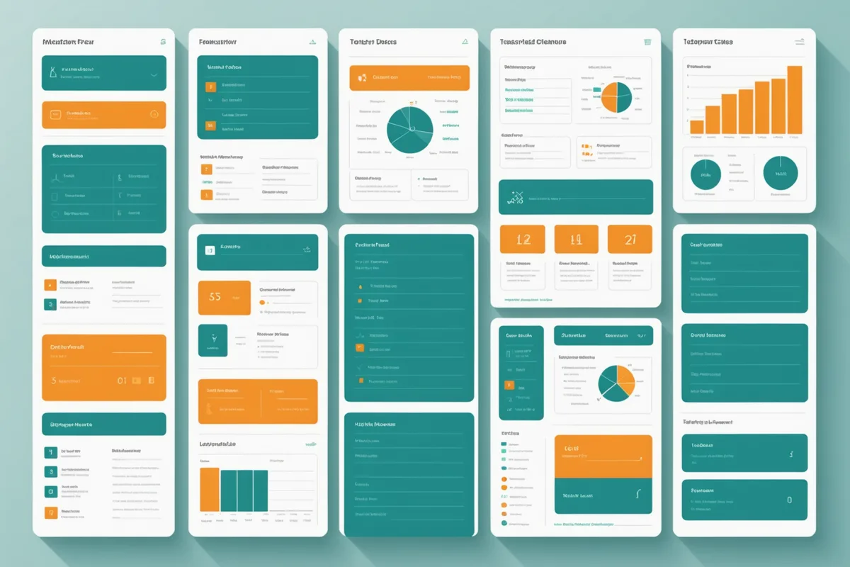
Most learning analytics dashboards were designed by people who were not classroom teachers, with input from administrators who evaluate tools in meetings rather than in classrooms. The result is a category of products that are impressive in demos and neglected in daily use. Teachers open the dashboard for the first few weeks, find that it takes too long to extract what they need, and revert to their own mental models of where each student is.
We made a deliberate decision early in building our teacher view: do not start from what data we have available. Start from the question of what decision a teacher needs to make in the first five minutes of class. Every UI element should contribute to that decision or get cut.
What Teachers Actually Check Before Class
We did observation sessions with teachers in two of our pilot programs in fall 2025, watching how they used the dashboard in the 5-10 minutes before class started. The pattern was consistent across teachers with very different teaching styles and grade levels.
The first thing teachers checked was a global answer to: is anyone in trouble? Not "how is the class doing on average," not "what is the week-over-week trend," but specifically: which students need something different today compared to the standard lesson plan? This is a binary scan. Most students are fine and require no change to how the teacher planned class. A small number need attention. The dashboard's primary job is to surface that small number quickly.
The second thing they checked, when they had more time, was the shared concept that the highest number of students were currently working on. This informed whether a whole-class explanation was worthwhile before the adaptive session started, or whether the class was too distributed across different content areas for a single explanation to be useful.
That was essentially it for daily use. Everything else on the dashboard, detailed per-student session history, overall class progress curves, concept-level mastery distributions, was occasionally useful for planning but was not a daily decision input. Teachers told us they checked those views once a week at most, usually on Fridays when planning the following week.
What Our First Dashboard Got Wrong
Version 1 of our teacher view was a data-dense grid showing each student's current concept, their last session date, their cumulative mastery percentage, and a color-coded status indicator. We had designed it by asking "what data should we show?" rather than "what decision does this support?"
In observation sessions, teachers spent too long parsing the grid before identifying the students who needed attention. The cumulative mastery percentage was particularly distracting: it was prominently displayed and teachers would spend time thinking about what it meant relative to grade-level expectations, when what they needed was something much more immediate.
We also had a filter panel with eight toggle options for narrowing the view. Nobody used it. Teachers do not want to filter a 30-student class. They want an already-filtered view that surfaces the signal by default.
The Three-State Model
The redesign we shipped in March 2026 reduced the student state representation to three categories, displayed as the primary information layer in the class overview. The three states are:
On track. The student is progressing through their content graph at a pace consistent with their historical pattern, with no concept backlog and no prerequisite flags active. No teacher action needed today.
Needs check-in. The engine has flagged the student for one of two reasons: they are stuck in a repeat loop on the same concept across multiple sessions, or their retention model shows significant decay on a concept they were previously making good progress on. The flag is a suggestion to the teacher, not a directive. The teacher can look at the student's tile, see the specific flag reason, and decide whether to act on it.
Session not started. The student has not opened a session yet. This is primarily useful during class when the adaptive practice period is active. The teacher can see at a glance which students are off-task, which is information they would otherwise need to walk the room to gather.
The class pulse view shows all 30 students as tiles, color-coded to these three states, with the student name and one supporting data point visible on each tile. No toggle, no filter, no drill-down required to get the primary signal. The drill-down view for a specific student is one click away for when the teacher wants more context.
The Shared Concept View
Alongside the class pulse, we added a single row showing the top three concepts currently active across the most students. The format is simple: concept name, count of students currently working on it, and a two-color indicator showing whether more students are succeeding or struggling with that concept right now.
This gives the teacher what they need to decide whether to open class with a brief whole-class explanation. If 18 out of 30 students are working on the same concept and the struggling indicator is red, a five-minute targeted explanation before the adaptive session starts is likely to be worth it. If the class is distributed across seven different concepts with no dominant cluster, a whole-class explanation is probably not useful and the teacher can start the session immediately.
We are not saying this replaces teacher judgment. A teacher who knows that the class just came back from a holiday break will make different decisions than the dashboard suggests, because they know context the engine does not. The point is to give the teacher one decision-relevant signal, not to prescribe the decision.
What Gets Checked Weekly, Not Daily
We did not remove the data-dense views. We deprioritized them in the visual hierarchy and moved them to a separate "progress" tab. The weekly view gives teachers the per-student concept map, showing where each student is in the content graph relative to the curriculum timeline. For a student who is ahead, the teacher might reassign them to extension content. For a student who is significantly behind, the teacher might schedule a direct intervention or notify a parent.
The concept mastery distribution, showing the percentage of the class that has demonstrated mastery on each concept in the unit, is the view teachers use when planning which concepts to revisit in class. This is a planning tool, not a real-time tool, which is why it belongs in the weekly view rather than the daily one.
What We Still Have Wrong
The biggest unresolved design problem is the alert volume. On a day where multiple students are flagged for prerequisite issues, the "needs check-in" category can contain eight or ten students, which is more than a teacher can realistically address in a single class period. We have not solved the prioritization question: of the eight flagged students, which three should the teacher focus on first?
Our current approach is to rank flagged students by the severity of the decay signal, with the most urgent at the top of the tile grid. But "most urgent by engine estimate" is not the same as "most important to the teacher right now," and we know it. A teacher who knows a student has a family situation affecting their concentration will reasonably prioritize differently than the engine recommends. Building teacher-controllable priority weighting is on the roadmap, but we have not found a design that is useful without being complex to configure.
The dashboard question is ultimately a question about cognitive load during constrained time. A teacher checking the dashboard at 7:48 before an 8:00 class start cannot process anything that requires more than 20 seconds to interpret. If we cannot deliver the critical signal in 20 seconds, the dashboard will not be used, regardless of how useful the underlying data is. That constraint shapes every design decision we make in this part of the product.